 I’m excited to announce that I have a brand-new website for Adam Abrams Design – the business side of my online presence! It’s a quantum leap from my previous site in many ways and I hope you’ll take a moment to check it out.
www.adamabramsdesign.com
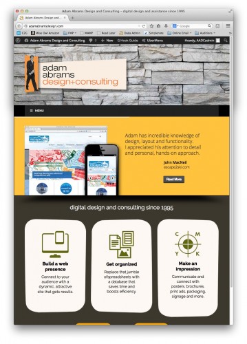
You’ll see that I’ve rebranded myself as “Adam Abrams Design + Consulting” – not just design, since I use so many other skills in addition to making things look good.
The main change was in how I present my work. I realized that just showing off a bunch of projects – no matter how attractive – makes the site all about me. It needed to be all about my audience – people with a problem to solve. I needed to make it clear how they could benefit from working with me.
Thanks to some high-profile quotes from several recent satisfied clients, and a much clearer indication of my main areas of expertise on the homepage, I think I’ve achieved that.
Of course, I updated the design. I still love me the retro, but I’ve refined the too-busy layout of my old site into something I like to think resembles a classic mid-century modern house, complete with stone texture. Fun but sophisticated, hopefully it says “come inside and make yourself comfortable!”
My featured projects are now completely up-to-date, with some ambitious recent ones properly showcased, as well as my newly-offered database expertise. And they’re “tagged” with multiple skill areas as appropriate. It’s a much more flexible way to organize and find projects.
Finally, the site is mobile-friendly, with a fluid layout that adapts to small screens with a simplified design. (Try resizing the homepage on a desktop browser and watch how the layout changes!)
I’d like to hear what you think – I welcome your feedback and opinions, and it’s good to know what the site looks like on the many different screens and devices out there. So drop by my new retro-modern site and have a look around!
I’m excited to announce that I have a brand-new website for Adam Abrams Design – the business side of my online presence! It’s a quantum leap from my previous site in many ways and I hope you’ll take a moment to check it out.
www.adamabramsdesign.com
You’ll see that I’ve rebranded myself as “Adam Abrams Design + Consulting” – not just design, since I use so many other skills in addition to making things look good.
The main change was in how I present my work. I realized that just showing off a bunch of projects – no matter how attractive – makes the site all about me. It needed to be all about my audience – people with a problem to solve. I needed to make it clear how they could benefit from working with me.
Thanks to some high-profile quotes from several recent satisfied clients, and a much clearer indication of my main areas of expertise on the homepage, I think I’ve achieved that.
Of course, I updated the design. I still love me the retro, but I’ve refined the too-busy layout of my old site into something I like to think resembles a classic mid-century modern house, complete with stone texture. Fun but sophisticated, hopefully it says “come inside and make yourself comfortable!”
My featured projects are now completely up-to-date, with some ambitious recent ones properly showcased, as well as my newly-offered database expertise. And they’re “tagged” with multiple skill areas as appropriate. It’s a much more flexible way to organize and find projects.
Finally, the site is mobile-friendly, with a fluid layout that adapts to small screens with a simplified design. (Try resizing the homepage on a desktop browser and watch how the layout changes!)
I’d like to hear what you think – I welcome your feedback and opinions, and it’s good to know what the site looks like on the many different screens and devices out there. So drop by my new retro-modern site and have a look around!