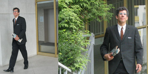
I’ve just updated my website with a new photo of me in full-on classic 1962 “Mad Men” style. I was overdue for an update since I’ve long since lost the scraggly goatee and ‘stache I was sporting for about a year and a half. But the only reason I have such carefully styled and posed new photos is because of an online contest that went horribly awry, and not just for me.
I was visiting Calgary in early August when I happened upon a Banana Republic store and saw that they were running contest called the “
Mad Men Casting Call“, a tie-in to the AMC series of which I’m a great fan. The idea was, you submit a photo of yourself in your best “Mad Men” look, and the winner gets a small walk-on role in the show!
I was hooked. After all, putting together a suitable entry pic would be a snap – I lived for the retro style, and everything I’d need for this was just waiting in my closet. And the fact that there was some creativity involved, not just a random winner out of thousands of entries, gave me a glimmer of hope that maybe I actually had a chance. I was excited!
The contest was ending soon, so I acted fast upon returning to the ‘Couv. A cloudy-bright Sunday provided the perfect lighting. I donned my vintage early 60’s black dress jacket with the narrow lapels, a crisp white shirt, and a skinny tie. Black pants and patent-leather dress shoes completed the look. Then Christine and I headed down to a suitably vintage-modern looking apartment building by the beach – only a few minutes away, but a half a century back in style. Soon, I had some great pics, including the one seen above with my “old phone” style cell phone handset. It only remained for me to put together my entry and submit it.
There was one possible problem with the whole attempt. The contest was almost over, and it turns out that the finalists were determined by popular vote. Yes, it was a popularity contest, barely a step up from random draw in terms of rewarding merit. He (or she) with the most friends wins. Still, I stayed optimistic – I have a pretty extensive network and was hopeful I could spread the word quickly in the 2 days remaining, and maybe actually have a shot.
But then it all went downhill.

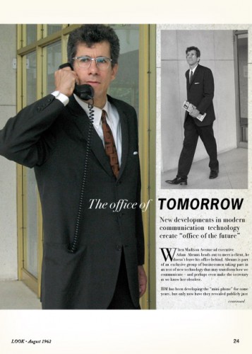
I slaved over an entry that I hoped would attract a little extra attention: a simulation of a 60’s magazine layout, complete with article and two photos. It came together pretty quickly, and soon I was ready to enter. I logged onto the site and filled out the info, including the special code number from the contest brochure I’d picked up at the Banana Republic store. I clicked to attach the photo, which I’d sized to a reasonable dimension for the web.
Nothing happened.
That’s when I thought to look at the contest FAQ, and saw that the maximum dimensions for the photo were smaller than what I’d submitted. Yikes! I tried resubmitting and my code was rejected – “Please enter an unused code”, it said.
There it was in one fell swoop:
a massive multiple FAIL of basic interface design principles and programming. A simple text line next to the photo submit button saying “Max 800 x 600 pixels” would have prevented the incorrect submission; a basic data check could have detected the incorrect size and notified the user; and worst of all, it’s a trivial matter in this web 2.0 world to auto-resize a photo to a specific dimension on the server side.
To twist the knife, this easy-to-make mistake invalidates your code and they expect you to trudge back down to Banana Republic to get another one. This even though
your entry was not even completed and they already can verify the code with your email address!
I wasn’t about to be defeated: I took swift and direct action and called AMC headquarters in New York. Incredibly, I actually reached someone who sounded helpful. They gave me an email address to send my photo to, and said they’d make sure it got entered.
Little did I know that bigger issues were about to make my problems entering irrelevant.
First, there was a rush on the site, or possibly a hack attempt, but at any rate, there was no access to the contest site the next morning. When it finally appeared again, my entry was not on there. Time was running out for me to be able to spread the word and get some votes!
The short version is, my photo never made it on there. But it turns out
I really had no chance anyway, no matter how good the photo was or how many of my friends voted. Why? Because the site was clearly “gamed” at the end. The server problems on the last day were fishy enough – but then the finalists were announced and it was crystal-clear that there had been some shenanigans.
The women look good, but
look at the losers that “topped the vote” for the men! MAYBE the first two qualify. But the rest have nothing to do with the basic premise – they aren’t even trying! I mean, what’s up with “Morgan Barclay”? The most boring suit imaginable. And a black T-shirt? A surfer dude in a tuxedo? It’s ridiculous.
An online forum on men’s fashion has a
pointed discussion and analysis of this whole sham. Some guys on that board entered as well, and they really did a great job – they put their heart into it. But it was all for nothing. At least it made me feel a lot better about not having gotten my entry in. I didn’t stand a chance.

I like to end on good news, though, and I can certainly do so here! I’ve needed business cards for a long time, and fully appreciate the irony of a graphic designer not having any. But I realized that I had the perfect material for one in these great photos I’d taken! So I put something together in short order, and now I have some very stylish, glossy, retro-looking business cards. I’ve carried the design of them through to the website for consistency.
So, while winning the contest was unlikely at best, in the end, something positive did indeed come out of all my efforts. Proving that pouring yourself into a creative endeavour is something you never regret.
Related
 I’ve just updated my website with a new photo of me in full-on classic 1962 “Mad Men” style. I was overdue for an update since I’ve long since lost the scraggly goatee and ‘stache I was sporting for about a year and a half. But the only reason I have such carefully styled and posed new photos is because of an online contest that went horribly awry, and not just for me.
I was visiting Calgary in early August when I happened upon a Banana Republic store and saw that they were running contest called the “Mad Men Casting Call“, a tie-in to the AMC series of which I’m a great fan. The idea was, you submit a photo of yourself in your best “Mad Men” look, and the winner gets a small walk-on role in the show!
I was hooked. After all, putting together a suitable entry pic would be a snap – I lived for the retro style, and everything I’d need for this was just waiting in my closet. And the fact that there was some creativity involved, not just a random winner out of thousands of entries, gave me a glimmer of hope that maybe I actually had a chance. I was excited!
The contest was ending soon, so I acted fast upon returning to the ‘Couv. A cloudy-bright Sunday provided the perfect lighting. I donned my vintage early 60’s black dress jacket with the narrow lapels, a crisp white shirt, and a skinny tie. Black pants and patent-leather dress shoes completed the look. Then Christine and I headed down to a suitably vintage-modern looking apartment building by the beach – only a few minutes away, but a half a century back in style. Soon, I had some great pics, including the one seen above with my “old phone” style cell phone handset. It only remained for me to put together my entry and submit it.
There was one possible problem with the whole attempt. The contest was almost over, and it turns out that the finalists were determined by popular vote. Yes, it was a popularity contest, barely a step up from random draw in terms of rewarding merit. He (or she) with the most friends wins. Still, I stayed optimistic – I have a pretty extensive network and was hopeful I could spread the word quickly in the 2 days remaining, and maybe actually have a shot.
But then it all went downhill.
 I slaved over an entry that I hoped would attract a little extra attention: a simulation of a 60’s magazine layout, complete with article and two photos. It came together pretty quickly, and soon I was ready to enter. I logged onto the site and filled out the info, including the special code number from the contest brochure I’d picked up at the Banana Republic store. I clicked to attach the photo, which I’d sized to a reasonable dimension for the web.
Nothing happened.
That’s when I thought to look at the contest FAQ, and saw that the maximum dimensions for the photo were smaller than what I’d submitted. Yikes! I tried resubmitting and my code was rejected – “Please enter an unused code”, it said.
There it was in one fell swoop: a massive multiple FAIL of basic interface design principles and programming. A simple text line next to the photo submit button saying “Max 800 x 600 pixels” would have prevented the incorrect submission; a basic data check could have detected the incorrect size and notified the user; and worst of all, it’s a trivial matter in this web 2.0 world to auto-resize a photo to a specific dimension on the server side.
To twist the knife, this easy-to-make mistake invalidates your code and they expect you to trudge back down to Banana Republic to get another one. This even though your entry was not even completed and they already can verify the code with your email address!
I wasn’t about to be defeated: I took swift and direct action and called AMC headquarters in New York. Incredibly, I actually reached someone who sounded helpful. They gave me an email address to send my photo to, and said they’d make sure it got entered.
Little did I know that bigger issues were about to make my problems entering irrelevant.
First, there was a rush on the site, or possibly a hack attempt, but at any rate, there was no access to the contest site the next morning. When it finally appeared again, my entry was not on there. Time was running out for me to be able to spread the word and get some votes!
The short version is, my photo never made it on there. But it turns out I really had no chance anyway, no matter how good the photo was or how many of my friends voted. Why? Because the site was clearly “gamed” at the end. The server problems on the last day were fishy enough – but then the finalists were announced and it was crystal-clear that there had been some shenanigans.
The women look good, but look at the losers that “topped the vote” for the men! MAYBE the first two qualify. But the rest have nothing to do with the basic premise – they aren’t even trying! I mean, what’s up with “Morgan Barclay”? The most boring suit imaginable. And a black T-shirt? A surfer dude in a tuxedo? It’s ridiculous.
An online forum on men’s fashion has a pointed discussion and analysis of this whole sham. Some guys on that board entered as well, and they really did a great job – they put their heart into it. But it was all for nothing. At least it made me feel a lot better about not having gotten my entry in. I didn’t stand a chance.
 I like to end on good news, though, and I can certainly do so here! I’ve needed business cards for a long time, and fully appreciate the irony of a graphic designer not having any. But I realized that I had the perfect material for one in these great photos I’d taken! So I put something together in short order, and now I have some very stylish, glossy, retro-looking business cards. I’ve carried the design of them through to the website for consistency.
So, while winning the contest was unlikely at best, in the end, something positive did indeed come out of all my efforts. Proving that pouring yourself into a creative endeavour is something you never regret.
Adam, you are the original Mad Man.